
The gallery
Samples~/Demo/Views/Gallery/ is a hub view with a sidebar of tabs and one nested view per page. Each page is a small, focused demonstration of one part of AUI.
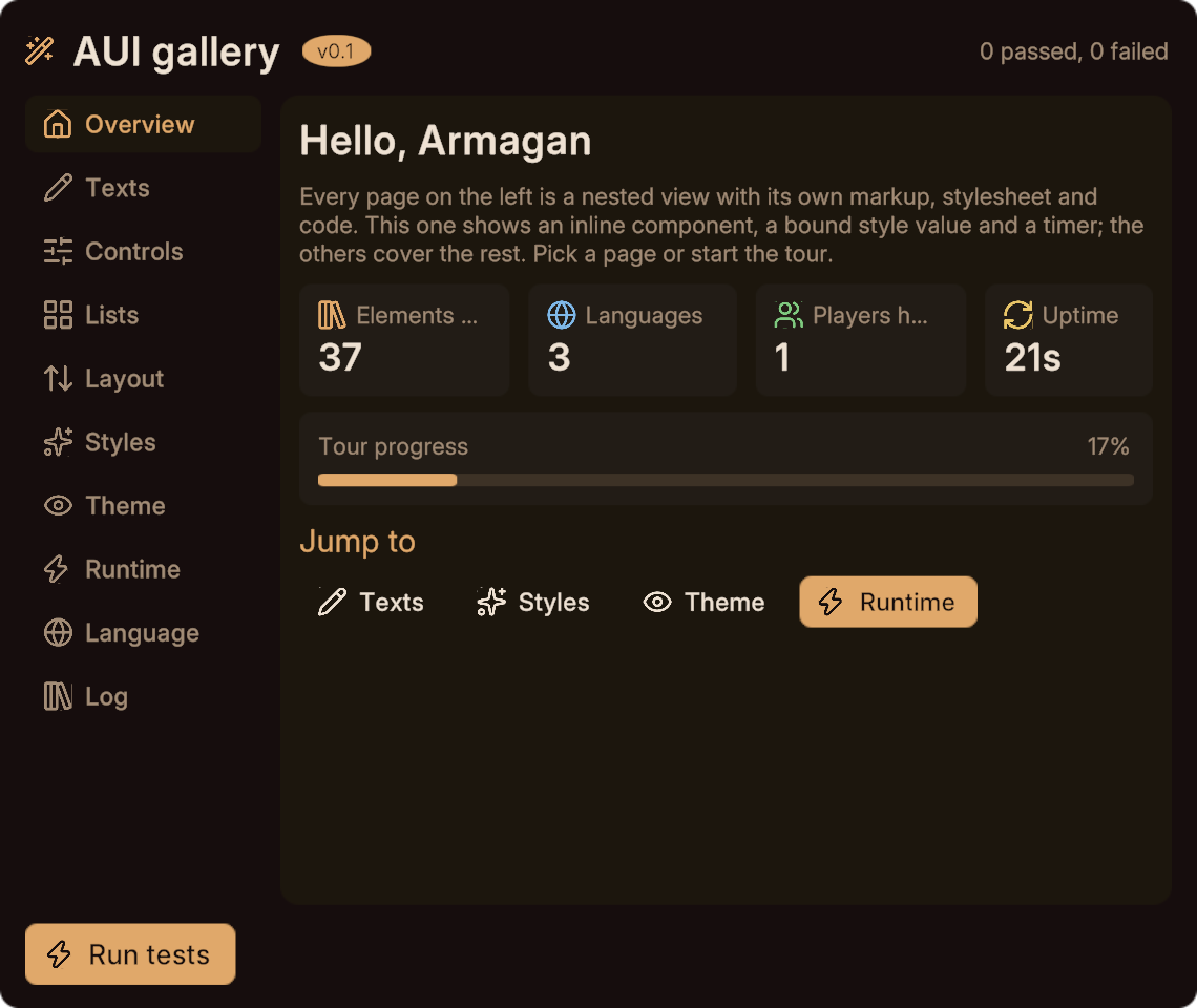
| Page | View | Demonstrates |
|---|---|---|
| Overview | HomeDemo | an inline <component>, a bound style value, a typed event, a timer |
| Texts | TextsDemo | keyed, placeholder, literal, wrapped and runtime text, escaping, size utilities |
| Controls | ControlsDemo | every control, including a runtime-filled select and an if banner |
| Lists | ListDemo | two repeats, <empty>, row handlers, a chip grid |
| Layout | LayoutDemo | a flex playground driven by bound style values |
| Styles | StatesDemo | the four states across three sheet tiers, then one card restyled four ways |
| Theme | ThemeDemo | :root variables rewritten in-world, per view or world-wide |
| Runtime | RuntimeDemo | templates, a pool, a nested view in a template, a modal |
| Language | LangDemo | the shipped picker, service read-backs, three placeholders |
| Log | (the hub) | everything the pages emitted, newest first, in a repeat |
The hub
AuiGallery.aui is worth reading first, because it shows how the pieces connect: a <tabs> laid out as a sidebar, a <pages> group with one nested view per page, and every child's events routed into a shared log.
<panel class="row body">
  <tabs bind="{page}" class="side" onchange="PageChanged">
    <tab page="home"     key="gallery.home"     icon="house"/>
    <tab page="texts"    key="gallery.texts"    icon="pencil"/>
    <!-- ... -->
  </tabs>
  <pages id="main" mode="crossfade">
    <page id="home"><HomeDemo on-navigate="Navigate"/></page>
    <page id="texts"><TextsDemo on-changed="TextsChanged"/></page>
    <!-- ... -->
  </pages>
</panel>

<style>
  /* The theme lays tabs out in a row; this view turns them into a sidebar. */
  .side { flex-direction: column; gap: 4; width: 150; align: stretch; }
  tab   { justify: start; padding: 8 12; font: 500 16; }
  pages { grow: 1; }
</style>
Note the shared sheet: every gallery page does <link href="Showcase.auis"/> and keeps its one-off rules in a <style> block. Because a <link> replaces the sibling sheet, there is no HomeDemo.auis.
Overview
An inline component used four times, so the four stat tiles cost nothing at runtime:
<component name="Stat">
  <prop name="label"/>
  <prop name="value"/>
  <prop name="icon" default="zap"/>
  <prop name="tone" default="accent"/>
  <panel class="kpi">
    <panel class="row" style="gap: 6">
      <icon name="{icon}" class="{tone}" size="16"/>
      <text key="{label}" class="hint tile" ellipsis="true"/>
    </panel>
    <text text="{value}" class="kpi-value tile"/>
  </panel>
</component>

<panel class="row">
  <Stat id="elements" label="home.elements"  value="{elemCount}" icon="library-big"/>
  <Stat id="langs"    label="home.languages" value="{langCount}" icon="globe" tone="info"/>
</panel>
and a progress bar whose width is a bound style value:
<panel class="bar"><panel class="fill" style="width: {progress}"/></panel>Progress = "62%";Controls
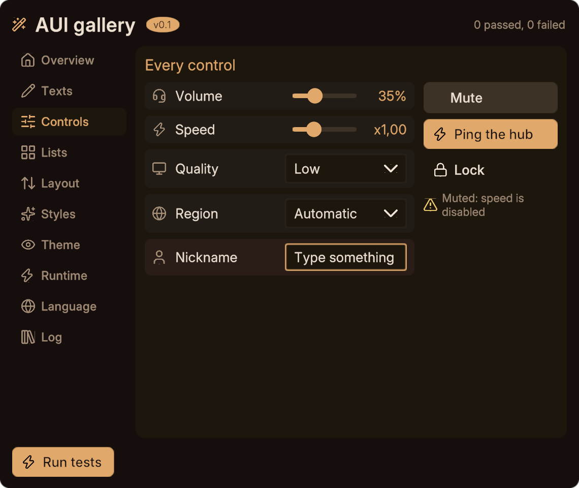
Every control on one page. The parts worth copying:
<slider bind="{speed}" min="0.5" max="2" step="0.05" decimals="2"
        format-key="controls.times" disabled="{mute}" onchange="SpeedChanged"/>

<select id="region" bind="{region}" max="6" onchange="RegionChanged">
  <option value="auto" key="controls.auto"/>
</select>

<input id="nick" bind="{nick}" placeholder-key="controls.nickHint"
       maxlength="16" onsubmit="NickSubmitted"/>

<panel id="banner" class="row" if="{mute}" style="gap: 6">
  <icon name="triangle-alert" class="warn" size="16"/>
  <text key="controls.muted" class="hint" wrap="true" style="max-width: 140"/>
</panel>
disabled="{mute}" greys the speed slider from a binding. max="6" on the region select reserves six option slots to fill at runtime, though only one is authored.
Lists
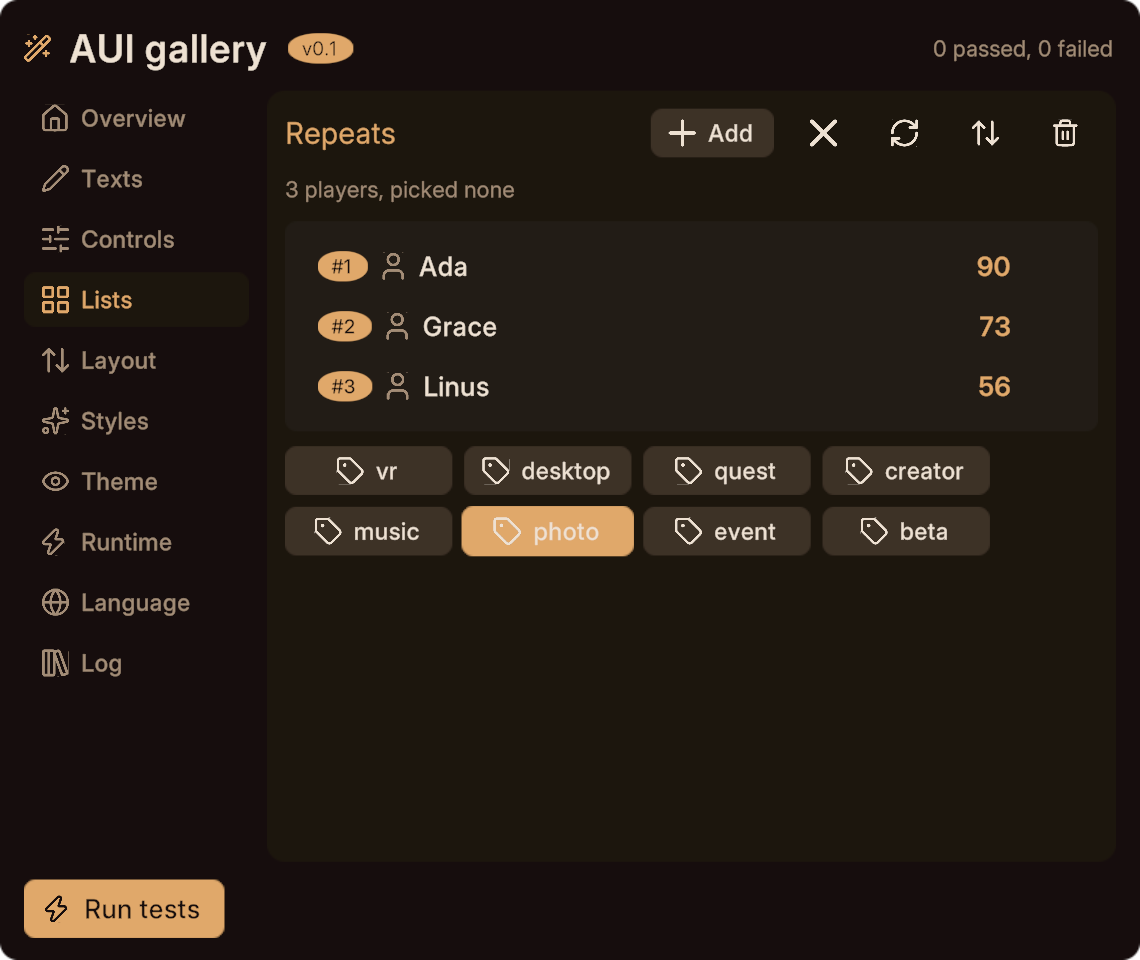
Two repeats. A leaderboard whose rows are buttons containing a toggle:
<repeat id="board" max="5" onselect="Pick" class="card" style="gap: 4">
  <button class="line" selected="{item.picked}">
    <panel class="badge"><text text="{item.rank}"/></panel>
    <text text="{item.name}" style="min-width: 130; max-width: 130; text-align: left"/>
    <spacer/>
    <text text="{item.score}" class="accent *font-semibold" style="min-width: 70; text-align: right"/>
    <toggle bind="{item.fav}" icon="heart" onchange="FavChanged" class="fav"/>
  </button>
  <empty><text key="lists.empty" class="hint"/></empty>
</repeat>public void Pick(int row) { }
public void FavChanged(int row, bool value) { }The pinned min-width/max-width on the name and score columns is what makes the rows line up.
Runtime
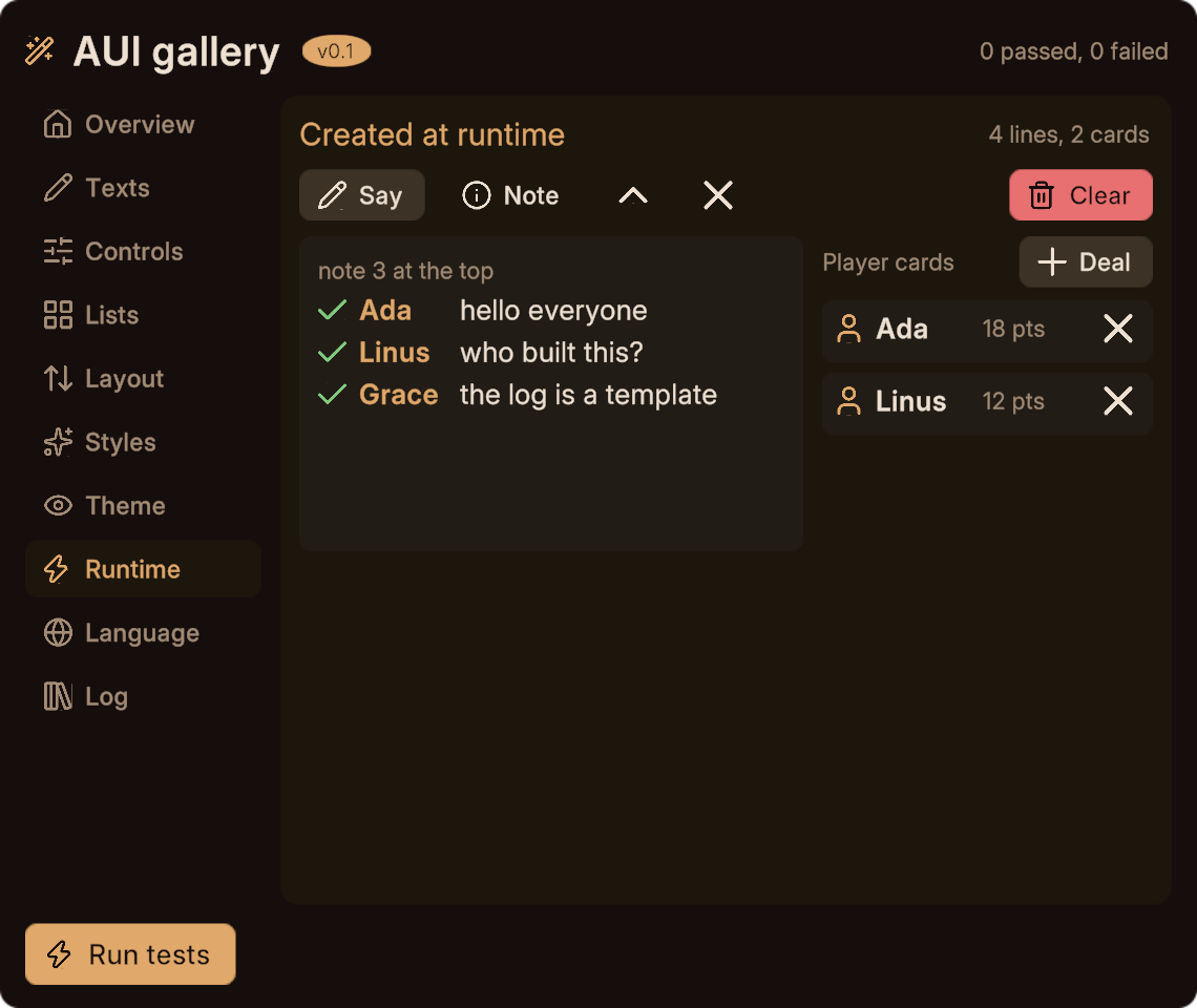
Nothing is instantiated in-world. A template of chat lines, a pool of plain texts, a template holding a nested view, and a modal. Every line and card above was linked in from a parked copy:
<view name="RuntimeDemo" width="566" height="514" pool="text:6"
      icons="check x info triangle-alert">

  <panel id="log" class="card *grow" style="gap: 4; min-height: 200"/>

  <template id="line" max="8">
    <panel class="row" style="gap: 8">
      <icon name="check" class="ok" size="16"/>
      <text text="{item.who}" class="accent *font-semibold" style="min-width: 56"/>
      <text text="{item.msg}" style="max-width: 220"/>
    </panel>
  </template>

  <template id="cards" max="3">
    <PlayerCard on-kicked="CardKicked"/>
  </template>

  <modal id="confirm" enabled="{asking}" onclose="Cancelled" show="fade-scale">
    <text key="runtime.sure" class="section"/>
    <panel class="row">
      <spacer/>
      <button onclick="CloseConfirm" key="runtime.no" class="ghost"/>
      <button onclick="ConfirmClear" key="runtime.yes" class="danger"/>
    </panel>
  </modal>
</view>int line = CreateLine(E_LOG);
if (line >= 0) { SetLineWho(line, "you"); SetLineMsg(line, "hello"); }Note icons="check x info triangle-alert" on the root: icons used only from code have to be preloaded, or SetIcon has nothing to swap in.
A nested view inside a <template> has no single generated field, so its on-kicked handler receives the instance element first.
Styles
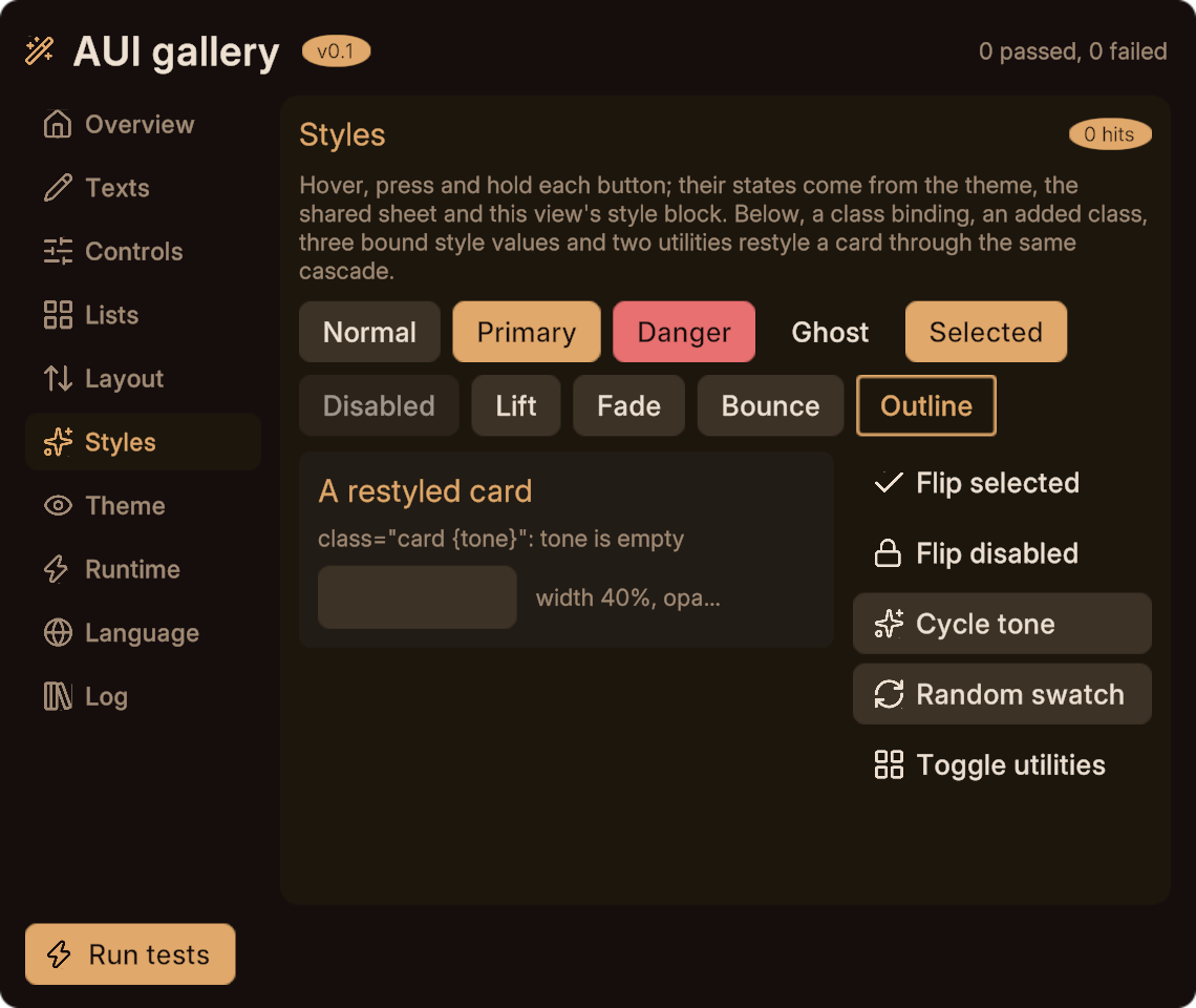
The four states across three sheet tiers, then one card restyled four different ways: a class binding, AddClass, bound style values, and utility classes toggled at runtime. It declares the utilities it uses only from code:
<view name="StatesDemo" utilities="opacity-50 scale-110 bg-accent" ...>Theme
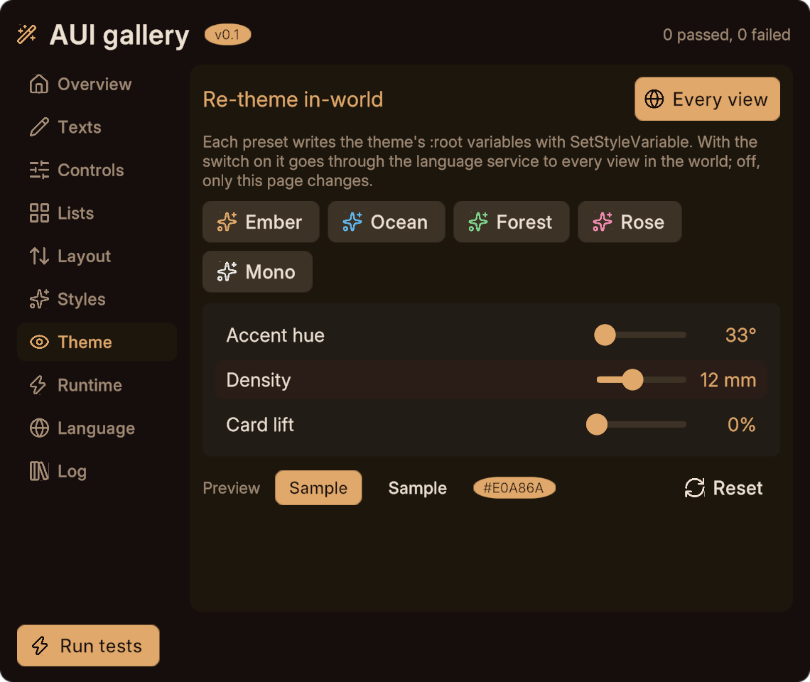
Five presets that rewrite the :root palette, plus hue, density and lift sliders. A switch chooses between this page only and, through the language service, every view in the world.
With that switch on, one click repaints the whole panel, hub and nested page together:
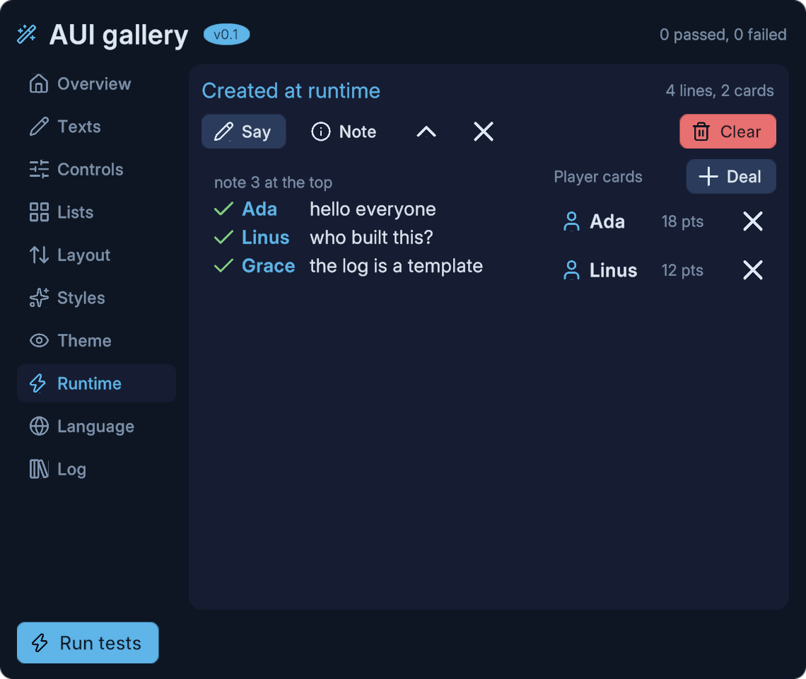
SetStyleVariable("accent", "#4FC3F7");        // this view and its children
lang.SetStyleVariable("accent", "#4FC3F7");   // every view in the scene
See theming.
PlayerCard
A small nested view with declared props and a typed event, dealt from a template by the Runtime page:
<view name="PlayerCard" width="300" height="60">
  <prop name="nick" default="anon"/>
  <prop name="score" type="int"/>
  <event name="kicked" type="int"/>
  <panel class="row">
    <text text="{nick}"/>
    <text text="{score}"/>
    <spacer/>
    <button onclick="Kick" icon="x"/>
  </panel>
</view>public void Kick() { EmitInt("kicked", Score); }The self-test
RunTests on the hub drives each child through its typed API and checks what rendered: bound text, escaping, placeholders, slider value and label, toggle, an if binding, select, runtime options, disabled and enabled buttons, child events bubbling, repeat count and visibility, a layout re-solve, state flags, a class binding, a variable round trip, template and nested-view creation, page selection and a language round trip.
Read it as the worked example of connecting views together.
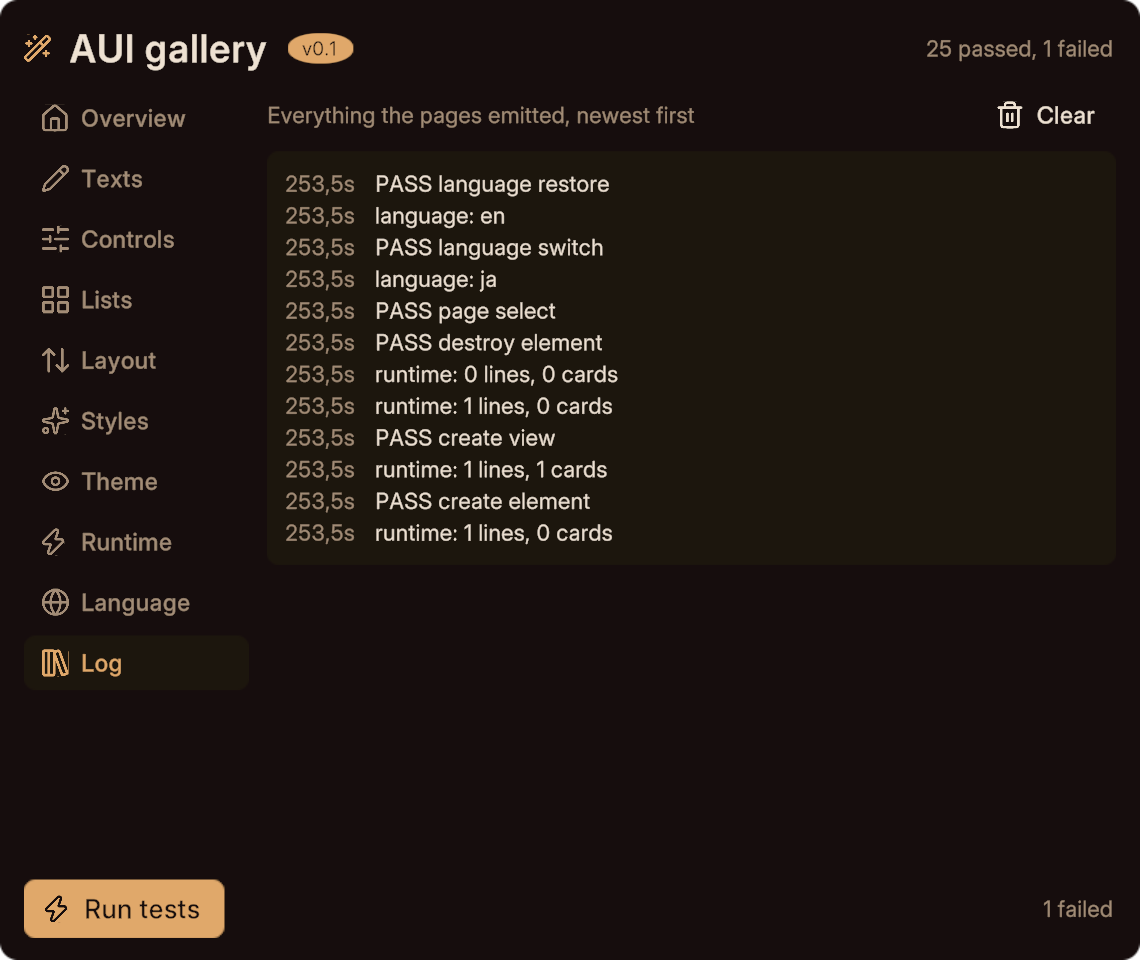
Every page's events, and every test result, land in the Log page's repeat, newest first.
Next
- Settings panel for a smaller, more typical panel.
- Recipes for snippets to copy.